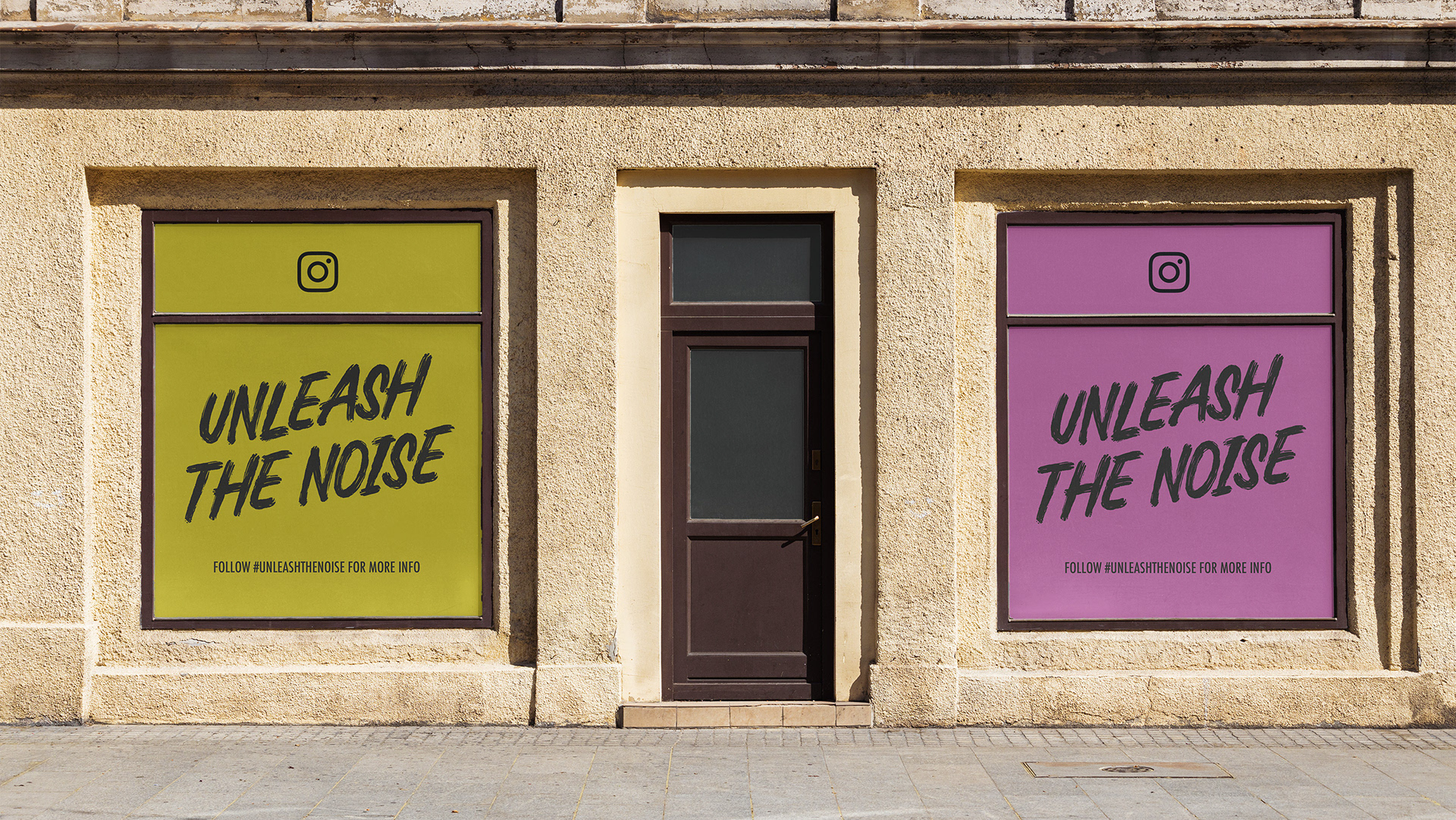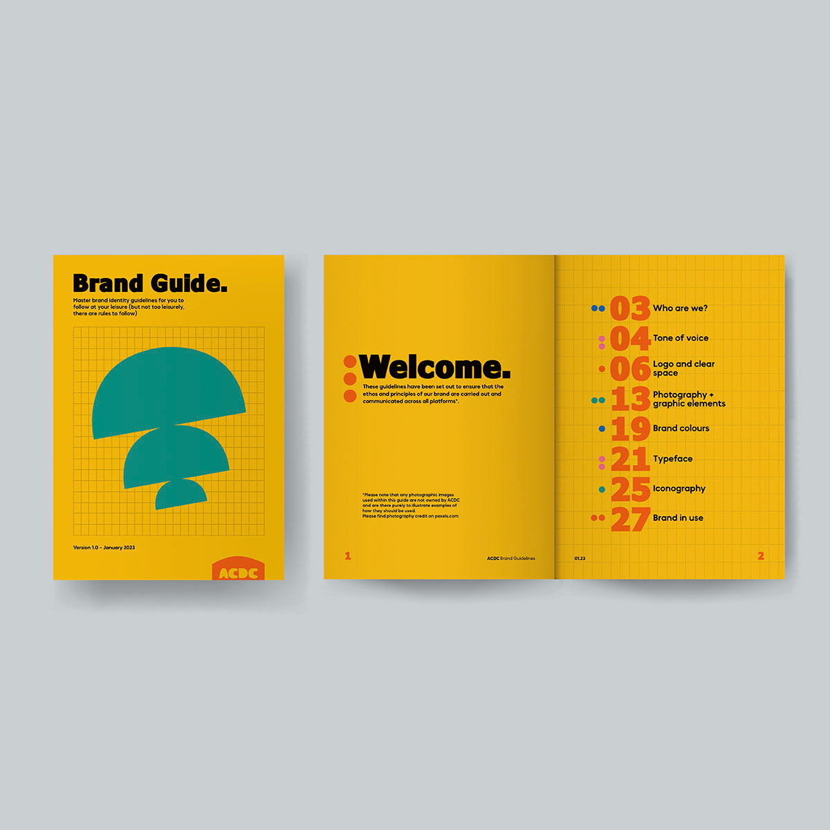
Add your mark to the southside.
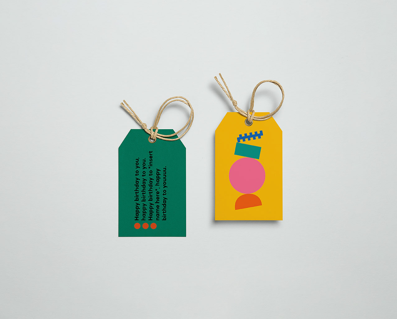
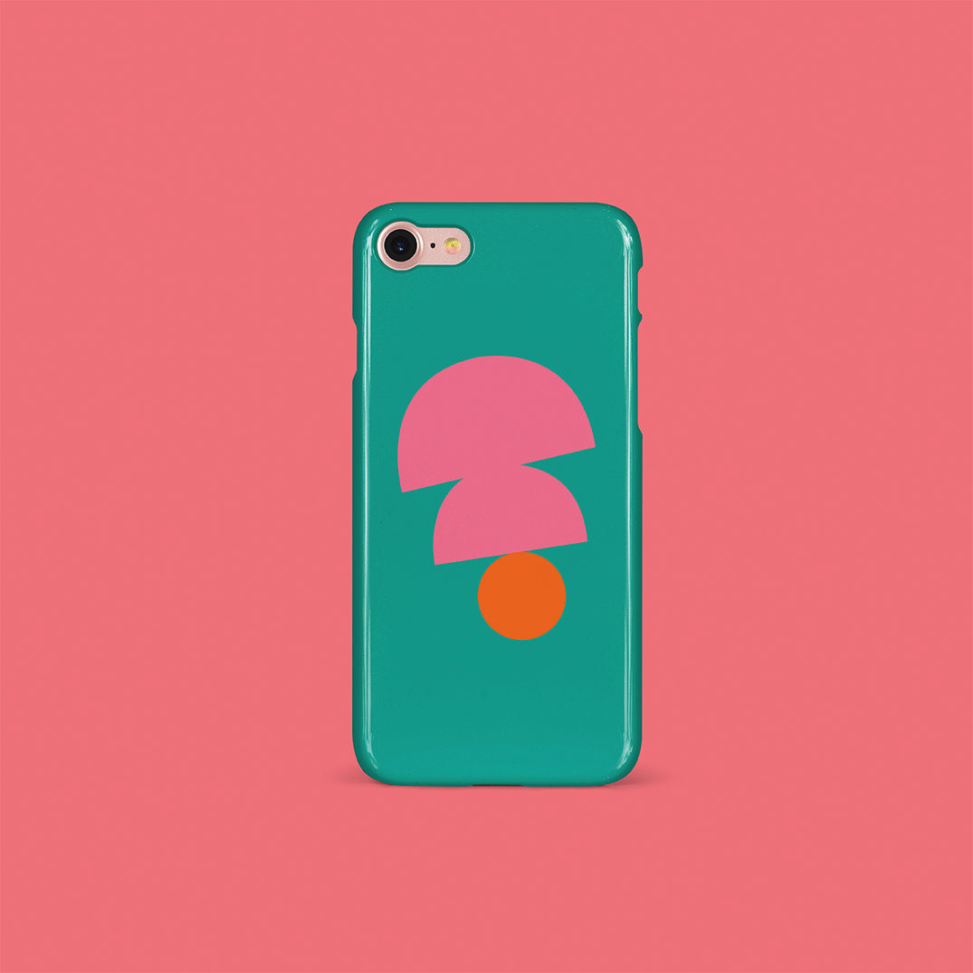
Using the tagline “Add your mark to the southside”, I let that guide my decisions in regards to colour, typography and overall tone of voice. The visual language is exciting, it’s bold, it’s unmissable, it’s fun. Most of all it’s welcoming.
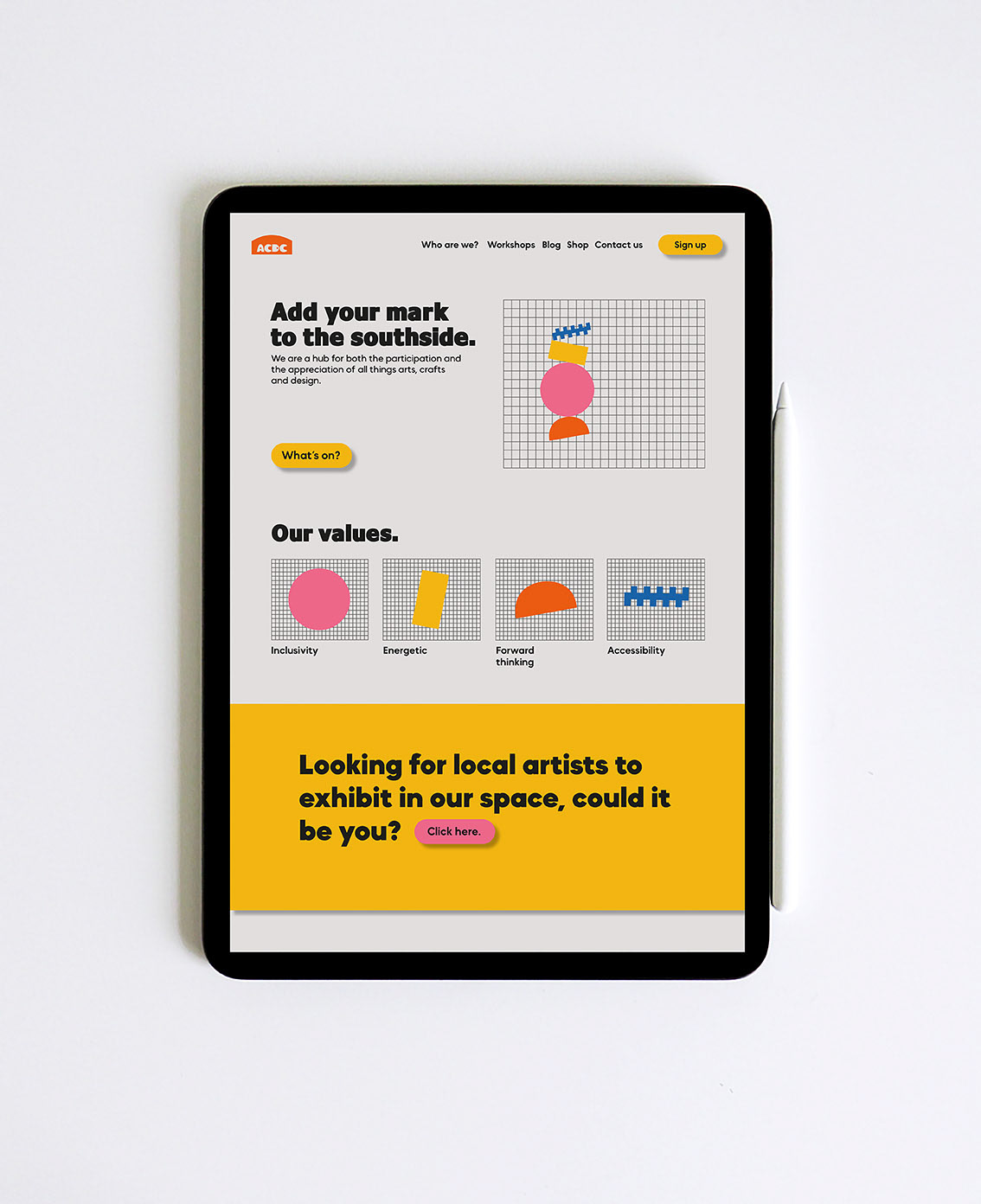
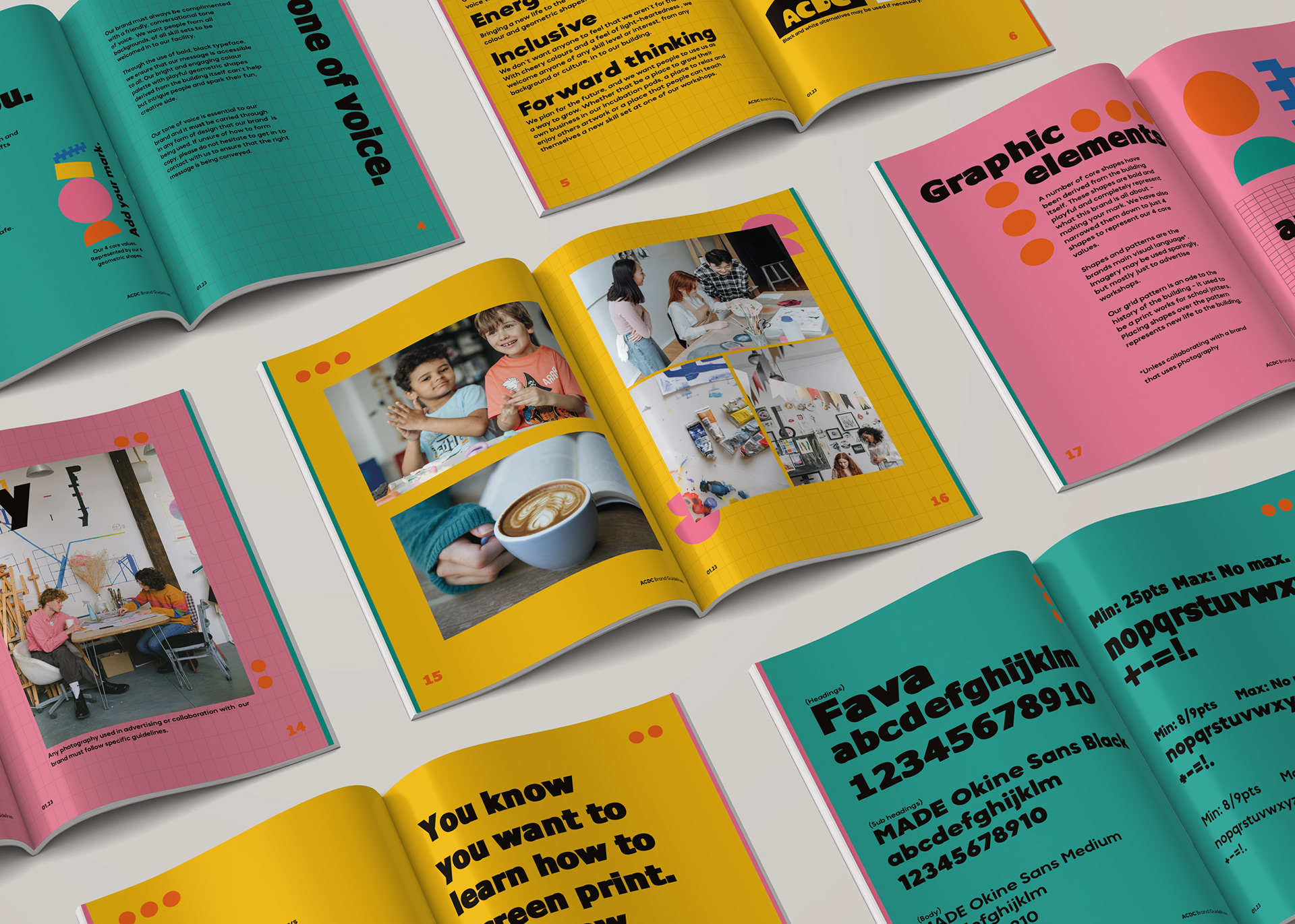
The tone of voice for the brand is very conversational and inviting. This tone is applied across all outputs for the brand. No matter what the context, the language is friendly and encouraging, funny at times, like a friend that always makes you feel good when you go to visit them.
This is also reinforced by the colours used throughout and the bold yet playful sans serif typeface.
Animations